Wednesday, August 27, 2008

Celebrating Nie Nie Day Tomorrow...


Thursday, August 27, is officially Nie Nie Day. There will be loads of auctions and blog entries celebrating the life of Stephanie Nielson all over the internet. You can read about Stephanie and her husband, Christian, below:


I was visiting one of my favorite blogs last night and learned of a catastrophic event affecting an entire family out in Arizona and Utah. Christian and Stephanie Nielson, parents to 4 small children, were seriously injured when the small plane they were in crashed. The pilot was killed and the Nielsons were badly burned. It is estimated the financial cost of their hospitalization and rehabilitation will skyrocket into the millions. Then there are the household and children's expenses on top of that.

Many people are offering prayers and donations to help the family through this. If you wish to make a donation, please click on the "donations for NieNie" logo below:


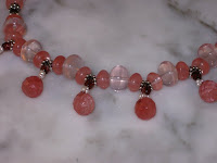
Any amount will be appreciated. I donated the proceeds from my last two sales on Etsy. In addition, the proceeds from the sale of this necklace will be donated.


Stephanie and Christian are expected to recover from their injuries eventually. The family is keeping a blog recording the progress of Stephanie and Christian if you want to read about them. After reading the blog I was deeply moved to help - the family are facing this terrible situation with spirituality, humility, and even humor.

For a list of auctions please visit this website and look for the Design Mom link.

Saturday, August 23, 2008

Finessing Those Details

It's official: I have a space at the Alternative Church Market in November. After meeting with the organizer of the charity event, I learned I'll be given a 30" x 70" table and "some floor space". No formal booth space is planned for any of the artists participating. It's going to be first come, first served. They take into account how much space we think we need, and how much is currently available, and then I guess we'll have to make it work. I'm planning a flexible display so I won't have a freak-out moment when I get there and find that whatever I had my heart set on won't fit my final allotment. Been there, done that!

I painted the hideous mirror frame that Marble Man found at the yard sale last weekend and it looks FAB-U-lous (as I knew it would)! The foamcore insert is almost done: cut to shape, covered with a piece of flannel, and then black velvet. I'm attaching some pretty teal ribbon at regular interval which the earring cards will hang from. That should look neater than pinning the cards to the velvet.


ribbon pinned in place (to be sewn down)


~

This morning I spent redesigning my earring cards, which were VEEeeerrrrry boring. I thought, "How fun would it be for a drawing of a woman's face to 'wear' the earrings?" I dug out my sketch pad and found a drawing which would work, made up a neat WORD document, and printed them out.

pencil drawings done last year


translated to a new application


I decided to use three different pictures so that it wouldn't look overwhelming to have 50-100 of the same image repeating across a wall. It'd be like looking through a fly's eyes!

I think they are really gorgeous , and can't believe it took me so long to design something like them before now. Let me know what you think: be honest now! Imagine walking into a space and being faced with a wall of these faces looking out at you. Do you think it will be too much? I'm hoping not - since I've already converted my inventory over to them! But, if the consensus is that it will be overkill, I can change them back.

Saturday, August 16, 2008

Beads Coming Together Beautifully

I've been having fun this weekend. Marble Man made sure I got some quality studio time today and look what my muse has inspired!

Gold yellow petal beads are tinged with a hint of blue and green


~
Swarovski crystal teardrops in a gorgeous sky blue


~

Pink glass petal beads surround tangerine Czech fire-polished crystals


These are so much fun to make that I'm going to make lots more.

~~~

On another note, I've gotta get moving! I just learned I'll have a space at a Church charity sale in town during November. I'm not sure how big the space is, but I do know they are providing me with one table. So, some creative thinking is in order to come up with a good way to display jewelry. I've been told I can use a few of my 2' x 6' grid panel to make a standing screen. And at a yard sale today, Marble Man found the greatest framed mirror! I removed the mirror, will paint the wood frame a nice burnished gold color, and then fill the frame with a velvet-covered board for pinning up earrings.

I'll keep you posted on booth design progress. And if any of you have suggestions: please pass them along - don't keep 'em to yourself!

Thanks.

Tuesday, August 12, 2008

Politicians are all the same...?

Welcome to the Theater of The Absurd. This arrived in an email today and gave me a good giggle. Then I was shaking my head in disbelief. "Huh? Is this guy really serious?" Then I googled it and found it was the comedy duo, John Clarke and Bryan Dawe. OK, now that we know it's a comedy routine, we can enjoy!


Thanks to everyone who has participated in the giveaway contest so far. For those who haven't, but still want to, it's not too late to enter.

Thursday, August 07, 2008

Another Giveaway

On Saturday, August 9th, I'm being featured on the blog, Handmade Showcase , which includes an earring giveaway. There are contest rules which you can find there (the drawing will take place on August 23rd at midnight). Please do participate in the contest - I want these little beauties to go to a loving home.


Materials:

Stacked vintage frosted white and lavender Lucite flower beads
Stacked antiqued brass bead caps
Swarovski crystals and sugalite rondelles
**Antiqued brass ear wires - will change to gold-filled if desired

Retail value $17.50


~


This week my time was consumed with retaking a bunch of photos with my spiffy new light box. I've found that black poster board makes a GREAT back sweep. With the bright lights it comes out a soft slate gray and shows off work to great advantage.


~

Part 2:

OK, OK, check this out you guys! I got some new toys in the form of acrylic risers in black and white. Look how FREAKING AWESOME these pictures came out!!


~


~


If I'm not careful, people are going to think I hired a professional photographer for these. I'm really liking this light box!

Friday, August 01, 2008

Learning A Thing or Two

For the past several months I've been trying to approximate professional-looking photographs of my pieces. I thought I had done a pretty good job, using a sweep of white silk and a window with a reasonable amount of natural light. This meant I could only shoot on sunny days, and between 1 and 3 PM, when the sun is in the correct position. Not satisfactory at all!

Last week, while Marble Man was off, sunning himself at the beach, I was at home dogsitting and spending a LOT of time online. I came across several blogs talking about light tents and light boxes. Hazaah! This is what I need. I Googled "light box" and found several nice ones, but, hey... they're really expensive! By the time I bought the tent, the lights, and a background sweep, I could expect to spend about $300. Then, I came upon a blog with a tutorial on how to make one myself out of an old box and some tissue paper. This is exciting. I have a box. And paper, and tape. OK, let's get started! There were some things about the design I didn't want, so I changed it a bit to suit my needs:

I would use a box that is at least 12" square. We're going to cut five sides out of the box, and leave one side intact as the base.

Measure 2" in from each corner and draw a line with a sharpie pen.


Then, with a box cutter, cut along the lines. PLEASE be careful - we don't want any accidental appendectomies or amputations.


Now tape white tissue paper on the outside of the box over four of the cut-out sides. One side remains open for the camera.


Finally, you will need a piece of white (or black) poster board, or bristol board for the back sweep. This creates a nice seamless picture with graduated shadows. You want it to start at the upper back corner and finish in the lower front corner. (I couldn't find a piece big enough to reach both corners, so I "made do" with a smaller piece for now. I'll replace it with a bigger one later.)

The other thing to consider is lighting. I tried using floodlights with regular incandescent bulbs. As you can see below, this was a mistake. The result was dim with a dark yellow cast. So, I broke down and ordered some special floods with tripod stands and tungsten bulbs. Wowie, zowie. Perfection!


Here's the finished setup:


Final result with camera set on "macro" and a light on each side of the box, pointing down through the tissue paper:


Now if I get the urge to take photos at 3 AM, I just flip a couple of switches and I'm good to go. Rainy days? No problem. There's nothing like having the right tools for the job at hand.